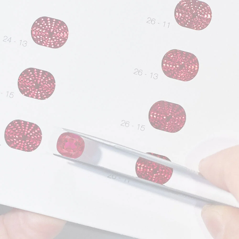
How to View a Faceted Gemstone
Brilliancy, intensity of color and areas of extinction are all important factors when assessing a faceted gemstone. However, for the sake of color comparison, an observer must blend all of these to assess the overall visual impression of a gem’s color and arrive at the best color match.
The face-up position, perpendicular to the table facet, is the recommended position to evaluate a gemstone’s color. It is also beneficial to tilt the gem slightly (up to approx. 25 or 30 degrees) to get the best overall impression of its color. The same motion should be done with the ColorCodex™ sheets themselves.
Windowing and Brilliance
The color windows in this system represent the full or nearly full brilliancy of a faceted gemstone. However, not all gemstones are cut with optimum proportions and therefore may reveal an effect known as ‘windowing’, where the color appears lighter. In these cases, attention should be focused more around the perimeter of such gems to arrive at the best color match.
To compensate for these areas, an observer may make a reference to the degree of windowing (e.g. small, medium or large) or brilliance (e.g. 100%, 70%, 50%, etc). A second ColorCodex™ reference for the color observed in the window can also be made.
For lighter colored, well-proportioned gems, it is also not uncommon to have areas of heightened brilliance, where the color of the gemstone is blown-out or diluted. These areas should not be considered when trying to arrive at the best color match.
Colors Falling Between Two or More Color Windows
Since color is a blend of hue, intensity and tone, it is understood that a gems’ color may fall in a range that lies in-between two or more windows. Therefore the system purposefully implemented alternating numbers along both the horizontal rows and the vertical columns, permitting intermediate colors to also readily have a ColorCodex™ reference. For example, a stone whose color falls between columns 50 and 52, is represented by 51. Additionally, if the color intensity is seen to reside between two color windows, such as 09 and 11, it is represented by the numeric value of 10.
Blank Color Windows
On select pages, a small number of color windows have been left blank. These represent areas where the color was not produced in that particular range of hue and intensity/saturation. However, by following the typical procedure for ColorCodex™ referencing, a color match can still be identified.


